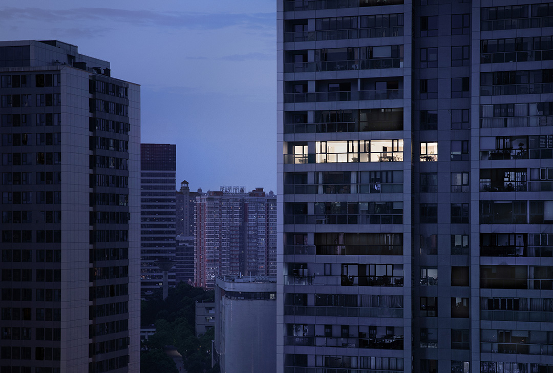
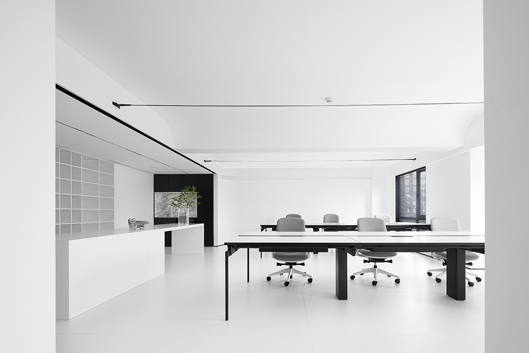
在經歷了兩年的沉淀后,知白設計從1.0時代開始邁向2.0時代,我們的白盒子也比之前擴大了一倍,希望在新的辦公空間上打破原有的生活化場景升級到藝術性,提高空間的氣質。作為自己的甲方,我們以”知白守黑“作為空間的設計的源頭,在空間和視覺上面來詮釋"知白“的理解。
白為方圓,白為點線面,

在經歷了兩年的沉淀后,知白設計從1.0時代開始邁向2.0時代,我們的白盒子也比之前擴大了一倍,希望在新的辦公空間上打破原有的生活化場景升級到藝術性,提高空間的氣質。作為自己的甲方,我們以”知白守黑“作為空間的設計的源頭,在空間和視覺上面來詮釋"知白“的理解。
After two years of precipitation, Zhibai Design has moved from the 1.0 era to the 2.0 era. Our white box has also doubled compared to before. We hope to break the original living scene and upgrade it to artistry in the new office space. , Improve the temperament of the space. As our own Party A, we use "Zhi Bai Shou Hei" as the source of space design, and interpret the understanding of "Zhi Bai" in terms of space and vision.
我是在嘗試探究一個叫做”白“的實體,以找到由人們自身文化設定的那些感覺之源。換句話說,我試圖找到那些通過”白“概念營造的簡潔和微妙的日本美學源頭。I am trying to explore an entity called "white" to find the source of those feelings set by people's own culture. In other words, I tried to find the source of simple and subtle Japanese aesthetics created through the concept of "white".在某些情況下,白意味著”空“。白作為”無顏色“轉化為一個”不存在“的符號。但空并不意味著”什么都沒有“或”零能量“。在很多情況下,其實它指的是一種狀態,或”機前“,即生手之意:將來是會被內容填滿的。在這一假設基礎上,使用白即能形成溝通的一種有力能量。——原研哉In some cases, white means "empty". White is transformed into a symbol of "nonexistence" as "no color". But being empty does not mean "nothing" or "zero energy". In many cases, it actually refers to a state, or "before the machine", which means novice: it will be filled with content in the future. Based on this assumption, the use of white can form a powerful energy for communication.——Kenya Hara


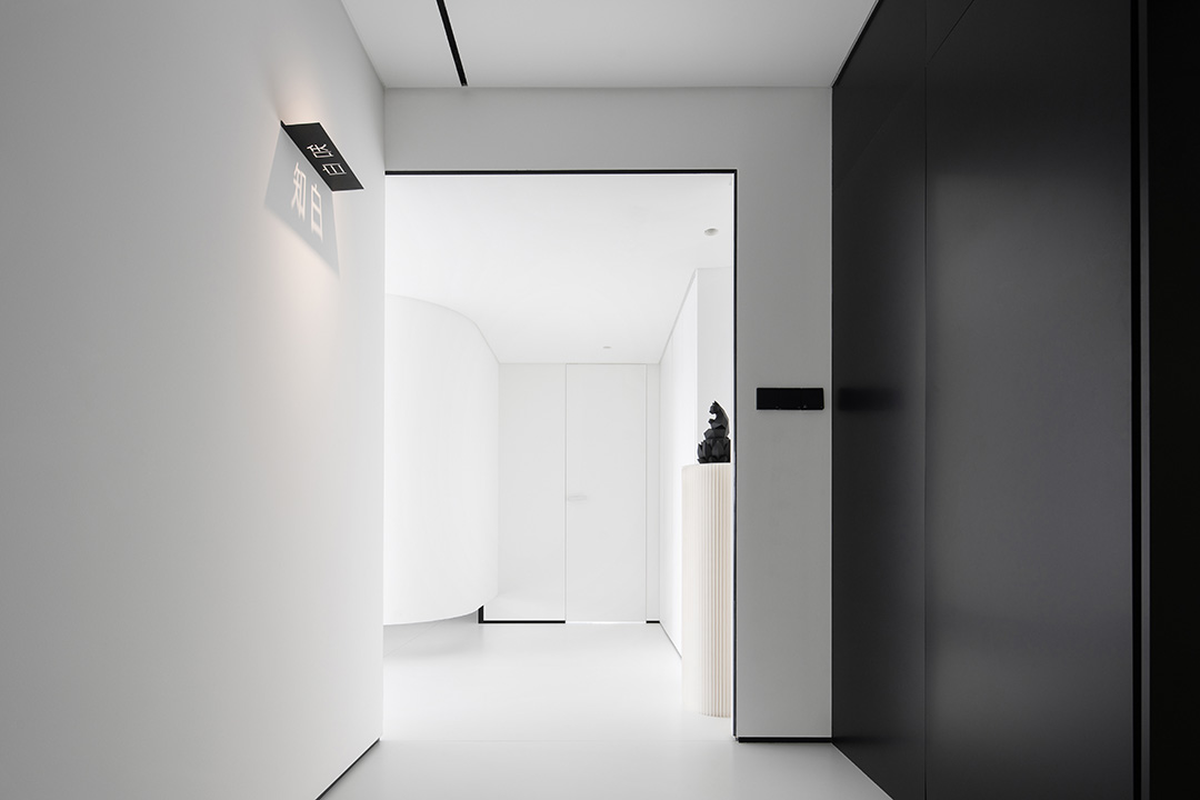
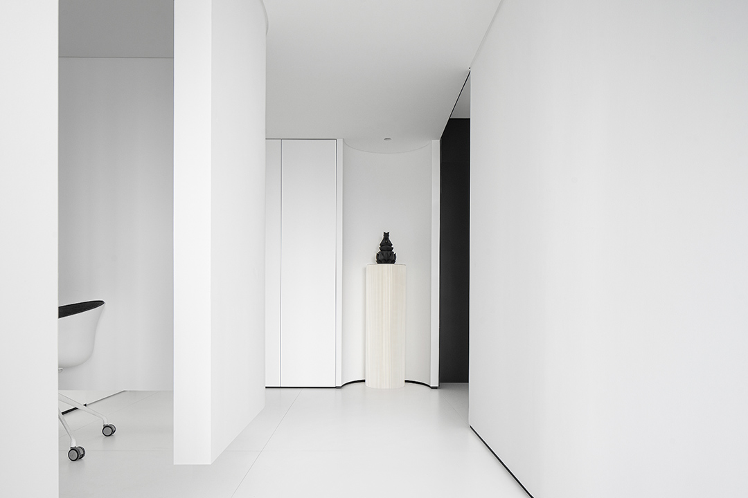
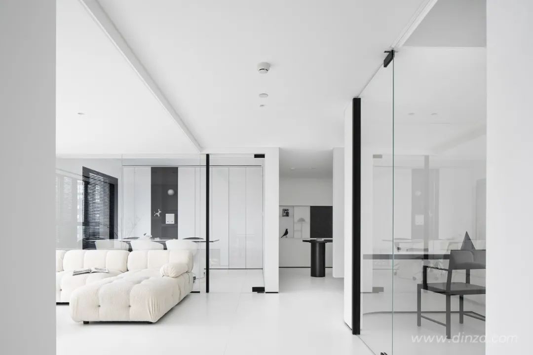
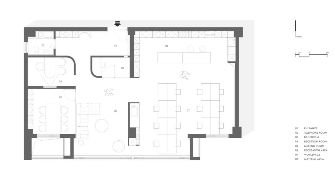
黑”與“白”自然相對,分別來對應“暗”與“明”,黑和白是相對的,是相生的,知道白為什么是白,也就知道了黑為什么是黑,就知道黑白可以相互轉化。空間入口從一個黑色的墻體進入到一個白色的空間,再進入到一個曲面空間,空間的轉換以不同組合形式,串聯起來,不同的方向和尺度關系,呈現出有趣的對比關系和節奏,私密到開放,狹窄與舒張、幽暗與明亮,并傳達出不同的空間情緒。
"Black" and "white" are naturally opposite, corresponding to "dark" and "bright" respectively. Black and white are relative and coexist. If you know why white is white, you know why black is black, and you know that black and white are possible. Mutual transformation. The space entrance enters from a black wall into a white space, and then into a curved space. The transformation of space is in different combinations and connected in series. The relationship of different directions and scales presents interesting contrasts and relationships. Rhythm, private to open, narrow and relaxed, dark and bright, and convey different spatial emotions.


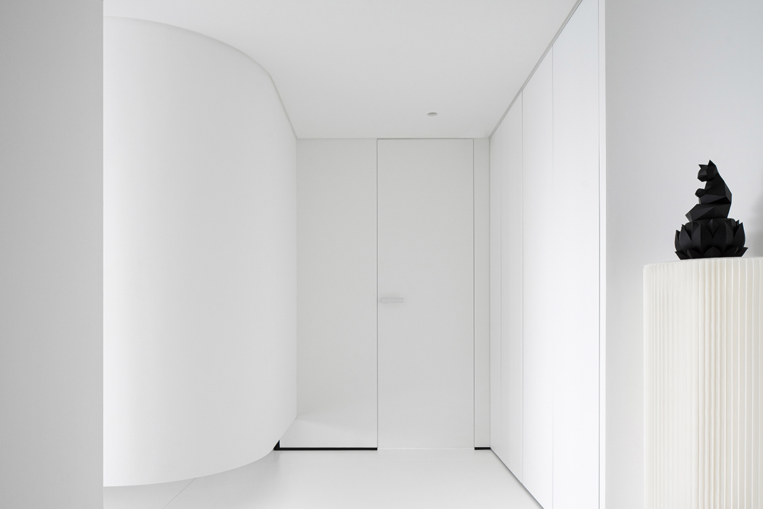
雖然方,圓和三角根植于傳統永不過時,但傳統一旦僵化被大量復制就是負擔,現代主義也像所有過去了的風格一樣站到了自己曾經反對的一面,成為建筑師的桎梏。Although squares,circles and triangles are rooted in traditions that will never go out of style,once the traditions become rigid and copied in large quantities, it is aburden. Modernism, like all styles in the past, stands on the side that it onceopposed and becomes the shackles of architects.圓在視覺形態上可以是點、線的構成,甚至形成面的處理。給人一種聚焦的視覺感受,表現手法直接、明確,便于受眾理解和記憶,容易引起人們的注意力。圓被稱為完美的圖形,包容性很強,幾乎可以和任何形狀的元素版面搭配,直觀感受,圓形沒有方形那么銳利,給人比較隨和、溫暖的感覺。圓形在空間的重構和創新,到半曲面的取舍,圓形的圖形抽象化,是對新的圖形運用的探索。
In terms of visual form, it can be the formation of points and lines, or even the processing of forming surfaces. Gives people a focused visual experience, the performance is direct and clear, easy for the audience to understand and remember, and easy to attract people's attention. The circle is called a perfect graphic, and it is very inclusive. It can be matched with almost any shape of the element layout. It is intuitive. The circle is not as sharp as the square, giving people a more easy-going and warm feeling. The reconstruction and innovation of the circle in the space, the choice to the semi-curved surface, and the abstraction of the circular figure are the exploration of the use of new figures.


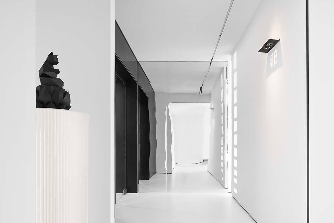
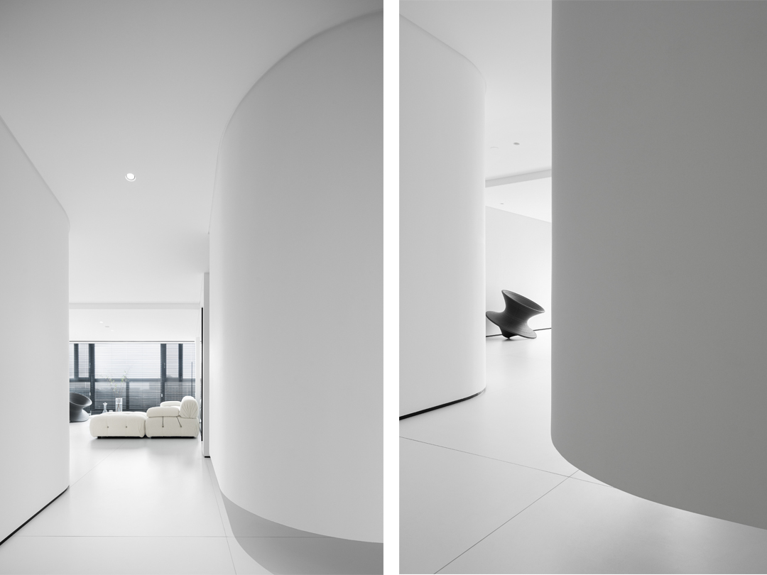
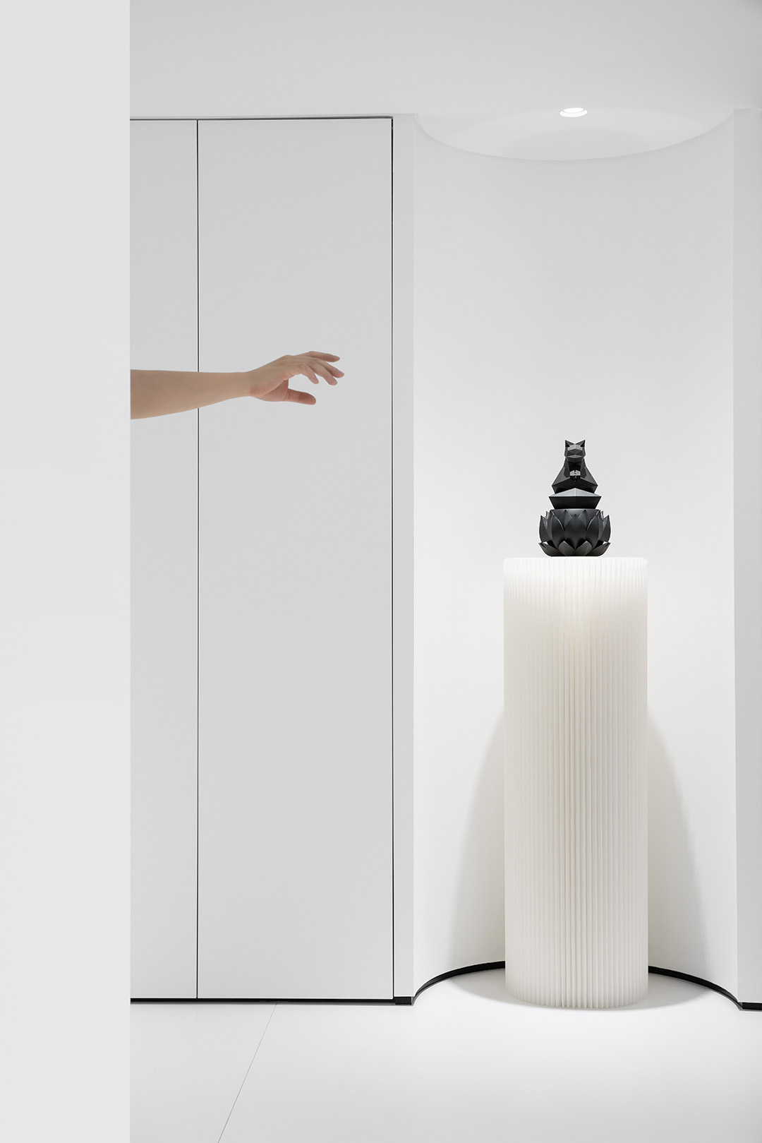
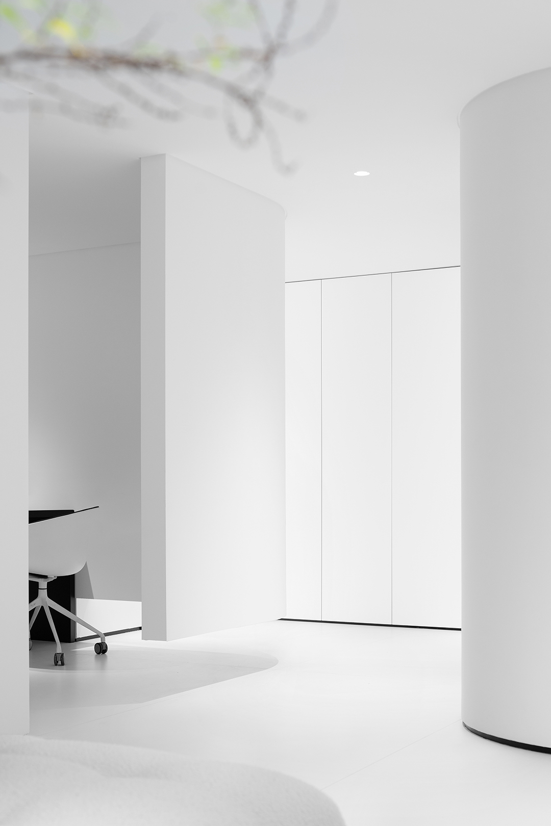
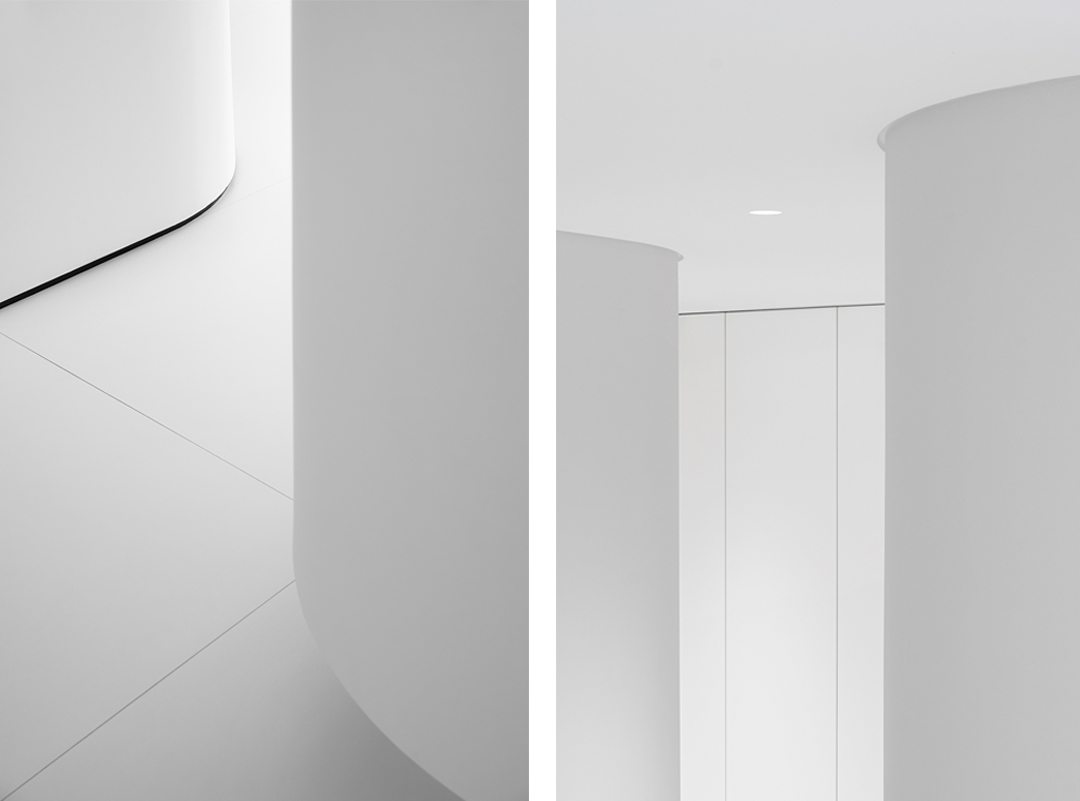
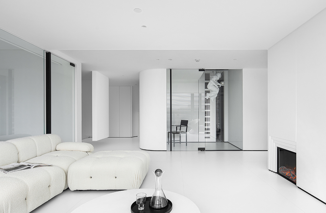
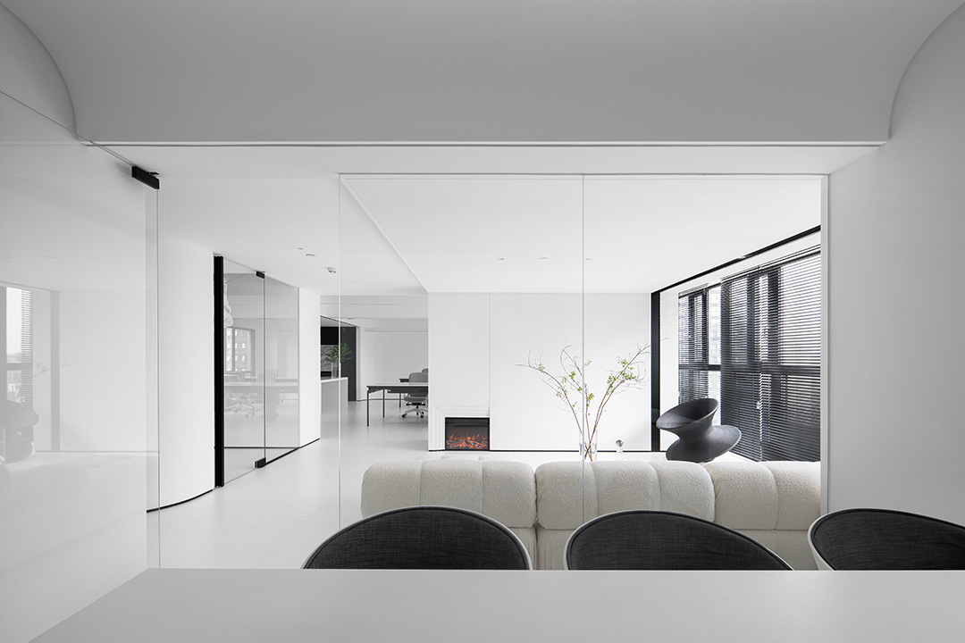
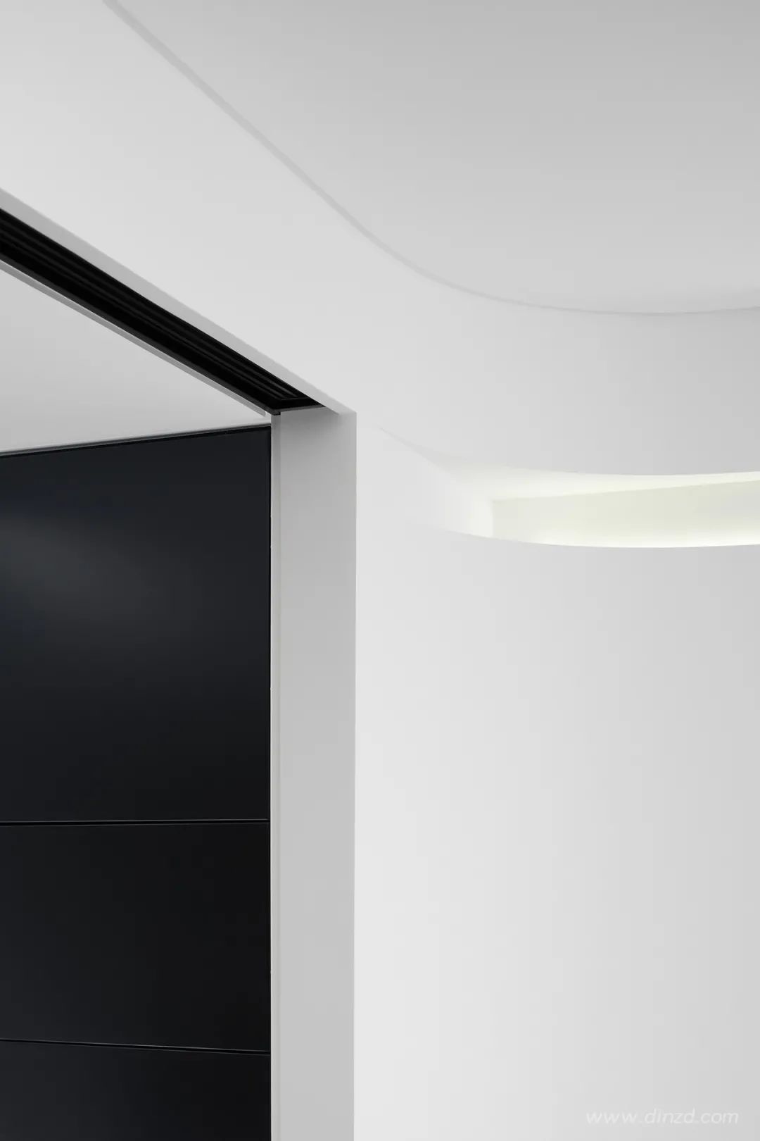
弧形的墻體相互交織,通透半通透的空間增加了空間的”透氣性“,創造出了曖昧柔和的空間邊界,弧形的空間圍合虛化掉了空間的緊張感,增添了空間的趣味性。接待空間曲線的圍合形式,不像直線般平淡,也不像折線般生硬,有一些柔美卻灑脫,謙遜卻不羈的感覺。
The arc-shaped walls are intertwined with each other. The transparent and semi-permeable space increases the “breathability” of the space, creating an ambiguous and soft space boundary. The arc-shaped space encloses and blurs the tension of the space and adds The fun of space. The curvilinear enclosing form of the reception space is not as plain as a straight line, nor as blunt as a broken line. It has some soft but free and easy, humble but unruly feeling.


構圖學三個要素:分割,視點和均衡。今天的分類基于分割和幾何。基本上絕不逃出三大基本幾何:方形,三角和圓形,這三個最簡單的幾何可以比作建筑里的三個基本柱式。Three elements of composition: segmentation, viewpoint and balance. Today's classification is based on segmentation and geometry. Basically, it will never escape from the three basic geometries: square, triangle and circle. These three simplest geometries can be compared to the three basic pillars in architecture.

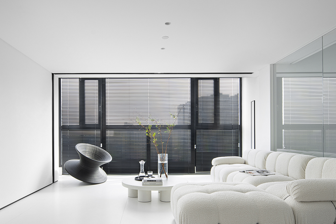
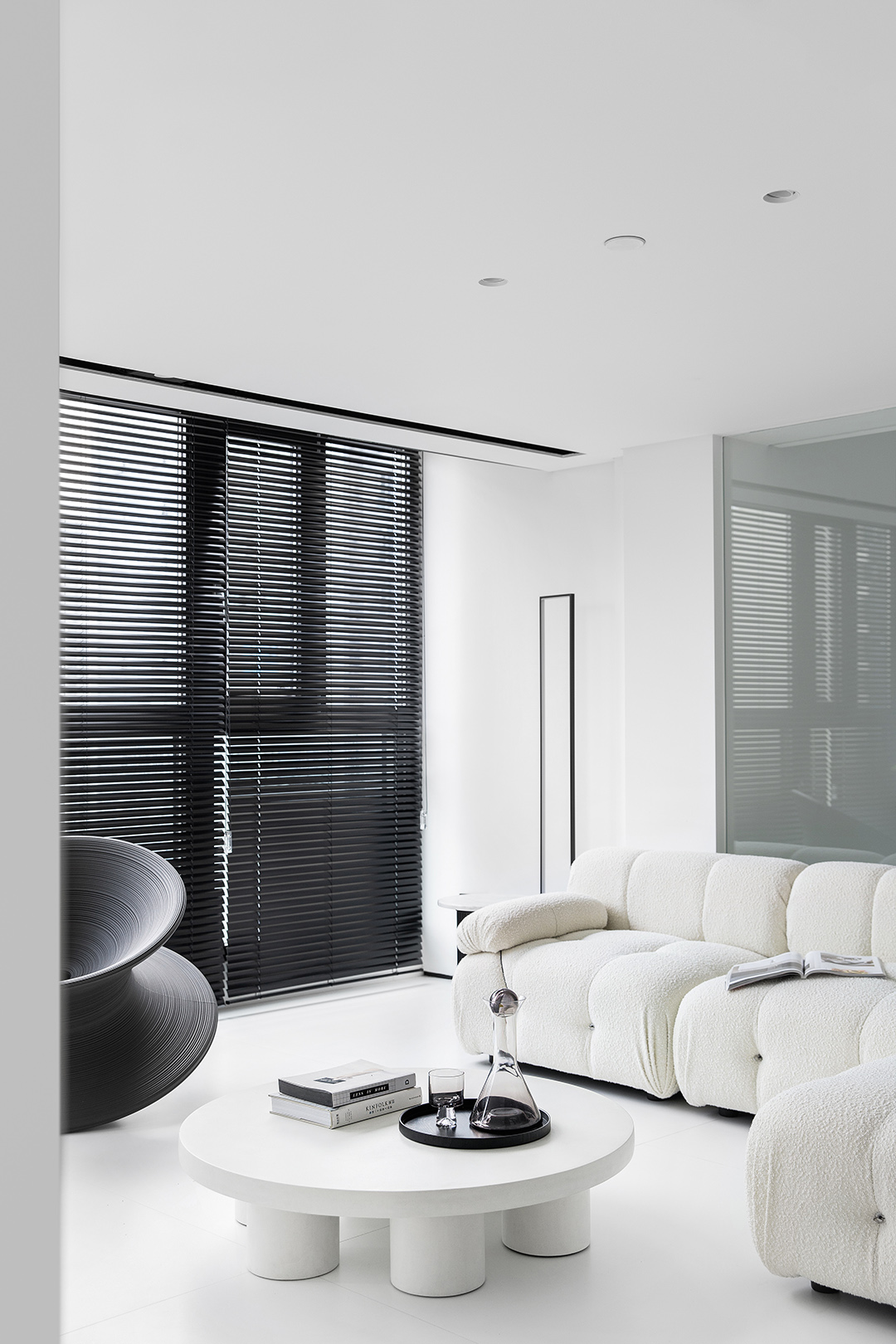
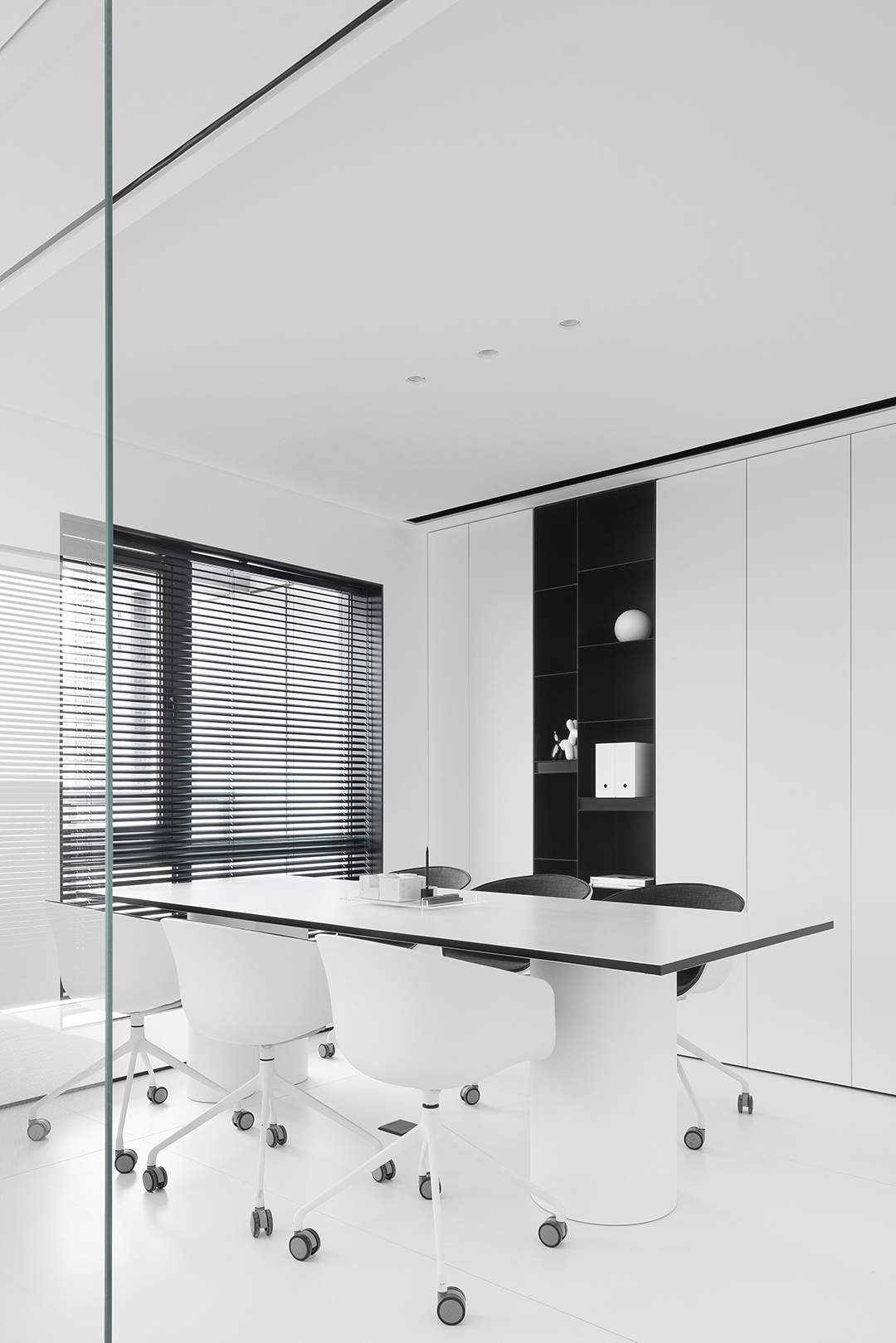
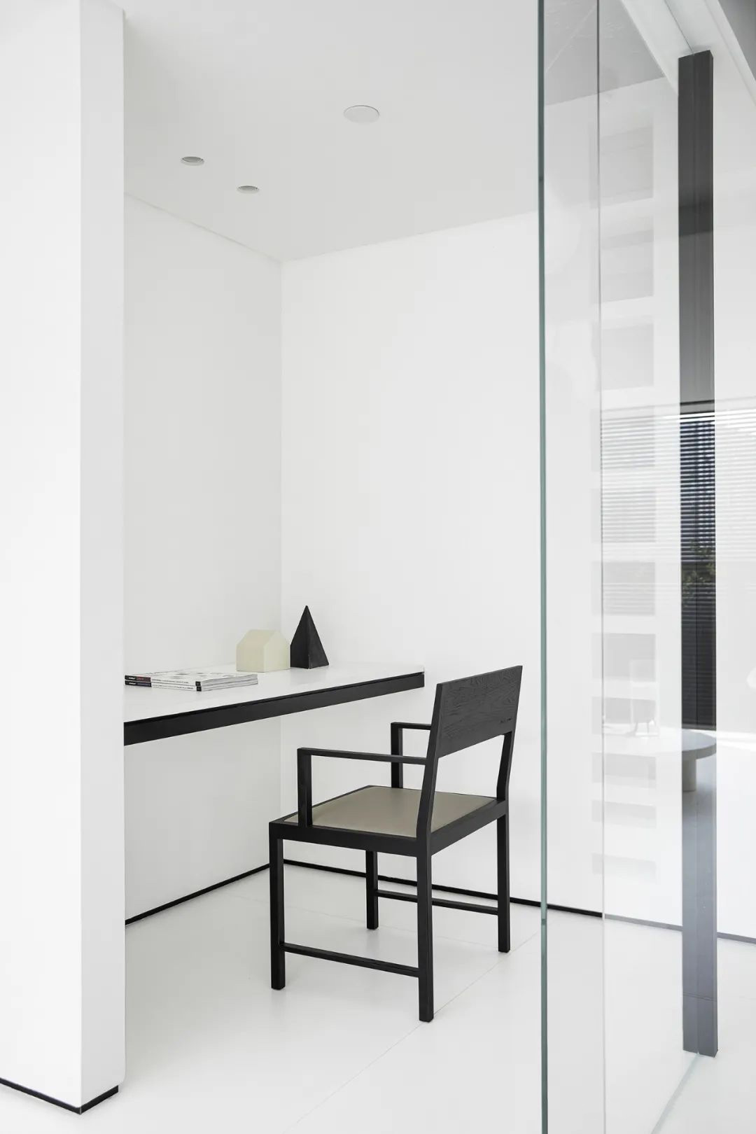
白色的立方體是一個簡單的盒子,通過立方體的體塊定位了空間的內核,凸顯出視覺的焦點。基礎的幾何形態,長久以來都占據著美學制高點。通過整面黑色的百葉來強化了視覺的中心,將空間焦點放到室外的城市外景中,凸顯了城市景觀。整個盒子,被賦予簡單純粹的色彩和材質,天花到墻面的折線,呈現豐富而有趣的空間構成和層次的延伸感。
The white cube is a simple box, and the core of the space is positioned through the volume of the cube, highlighting the focal point of vision. The basic geometric form has long occupied the commanding heights of aesthetics. The entire black louver is used to intensify the visual center, and the spatial focus is placed in the outdoor urban exterior scenery, highlighting the urban landscape. The entire box is given simple and pure colors and materials, and the folding line from the ceiling to the wall presents a rich and interesting spatial composition and a sense of level extension.


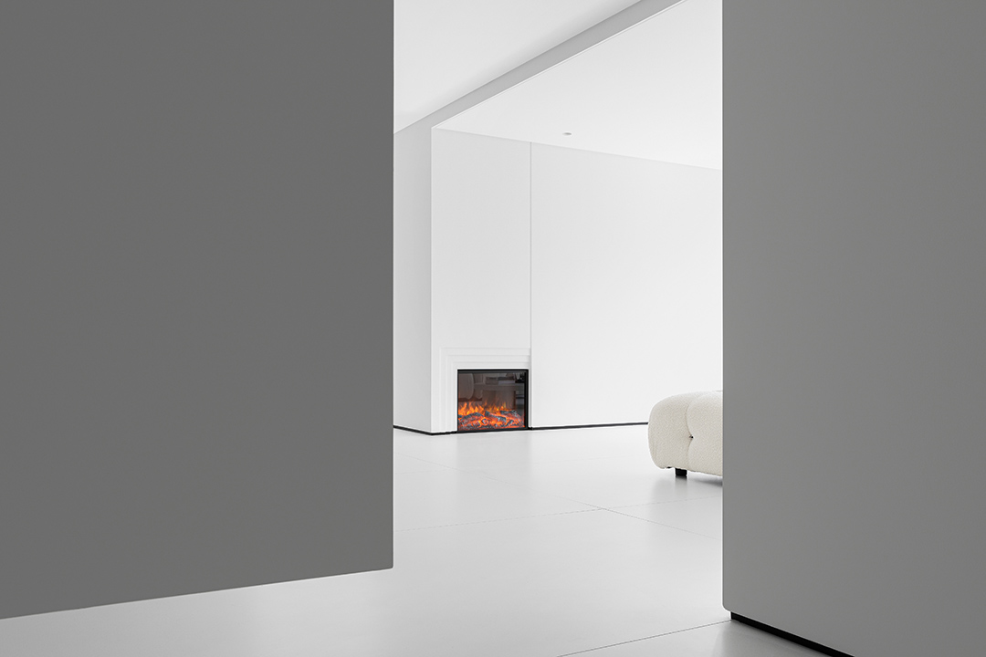
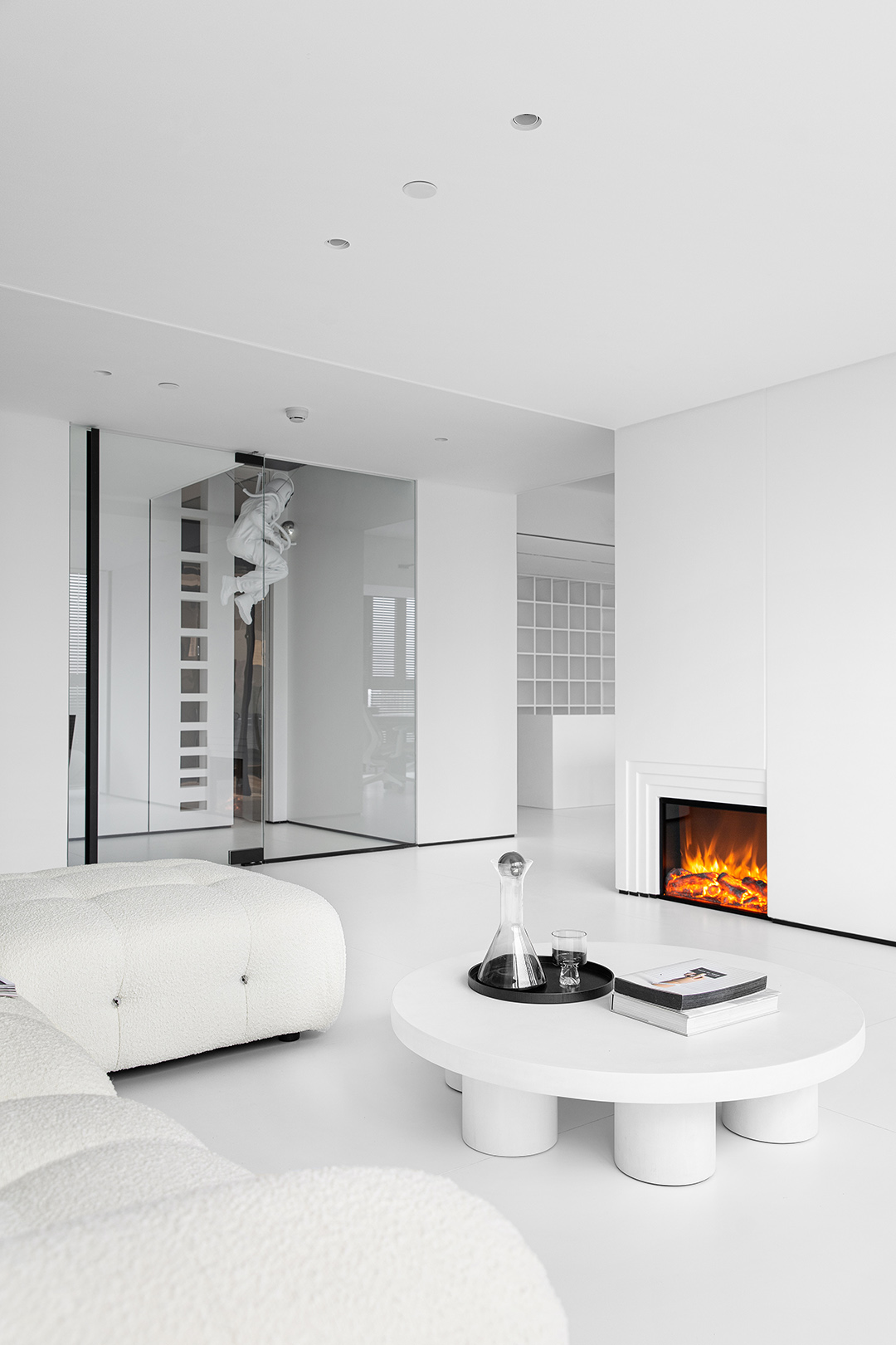
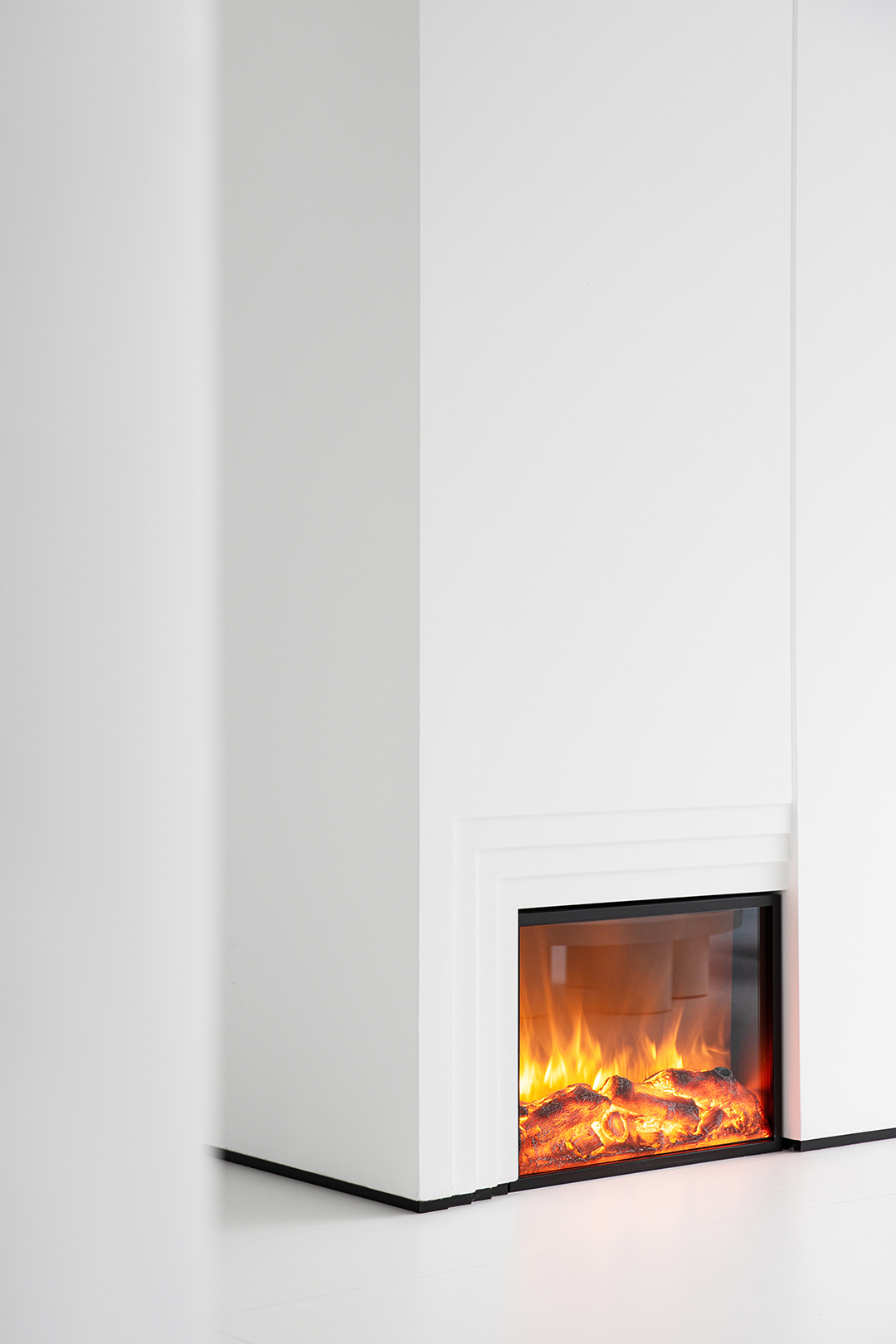
圖為MOLONEY/莫洛尼仿真火壁爐
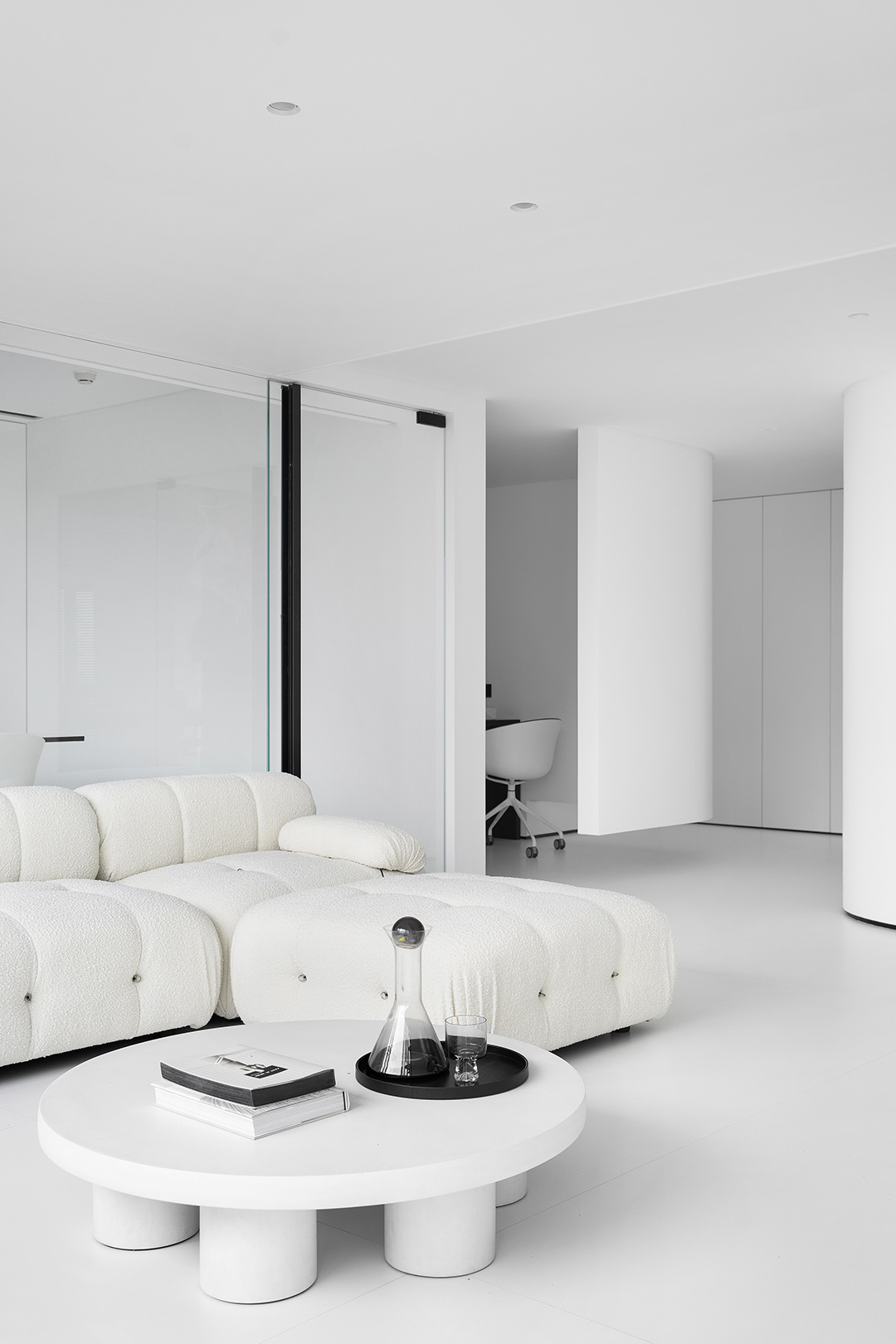
大小盒子的相互堆疊,對基礎的方塊進行組合產生不同的正相和負相空間,以不同組合方式,串聯起來,滿足了各種不同的功能,壁爐的設置體現了空間的動,提升的空間的整體氛圍。
The large and small boxes are stacked on each other, and the basic squares are combined to produce different positive and negative spaces. They are connected in series in different combinations to meet various functions. The setting of the fireplace reflects the movement of the space and the space for improvement. The overall atmosphere.


時空指的是在我們對于物體之間的空間以及事件之間的時間的集體經驗的基礎上所構建起來的任何的外在現實。每個時空都按照一定的規律運行著,他們是平行的,一般不會有交叉,只是有時間的先后,但例外的情況出現時空交叉,即時空錯亂。Space-time refers to any external reality constructed on the basis of our collective experience of the space between objects and the time between events. Each time and space runs in accordance with a certain rule. They are parallel. Generally, there is no crossover, but there is a time sequence. However, in exceptional cases, time and space cross and instantaneous space is disordered.

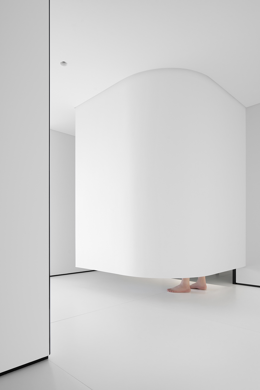
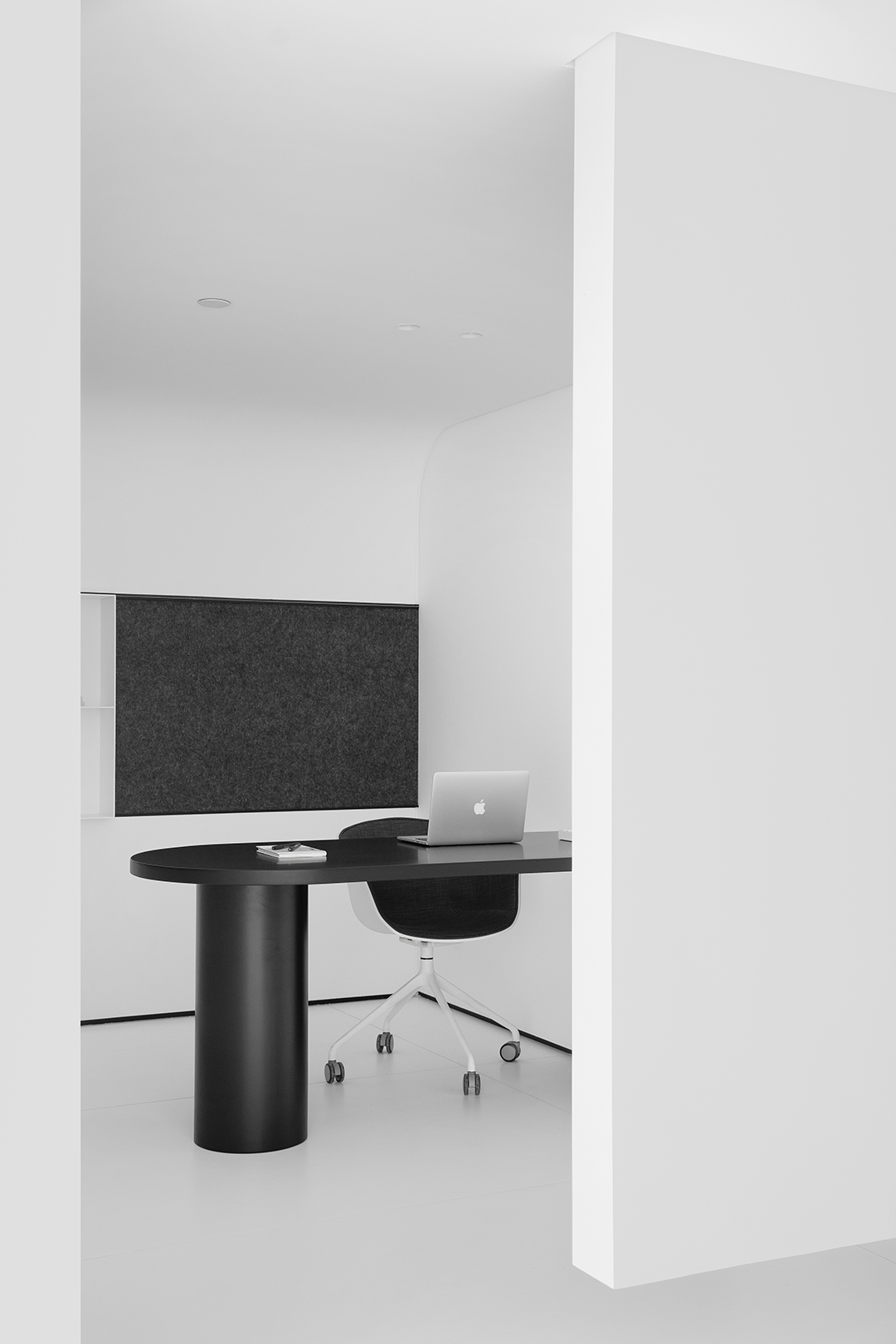
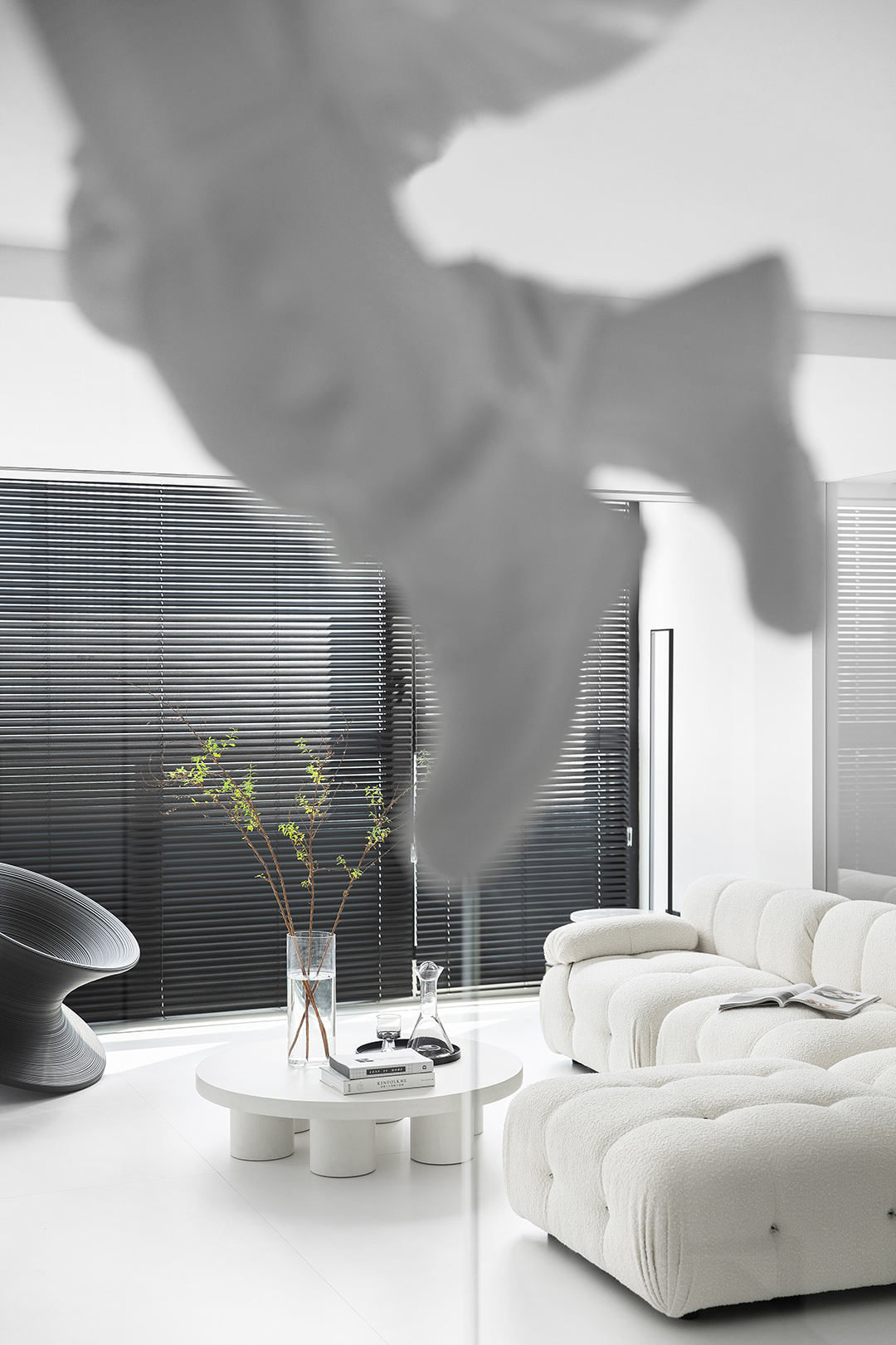
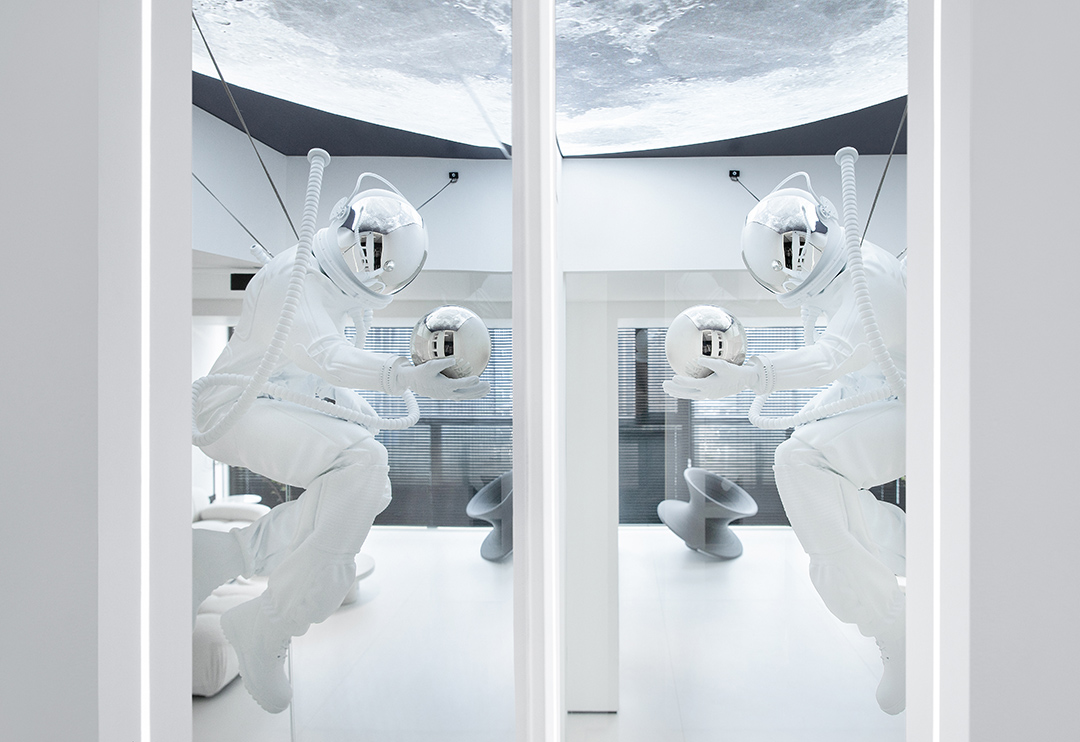
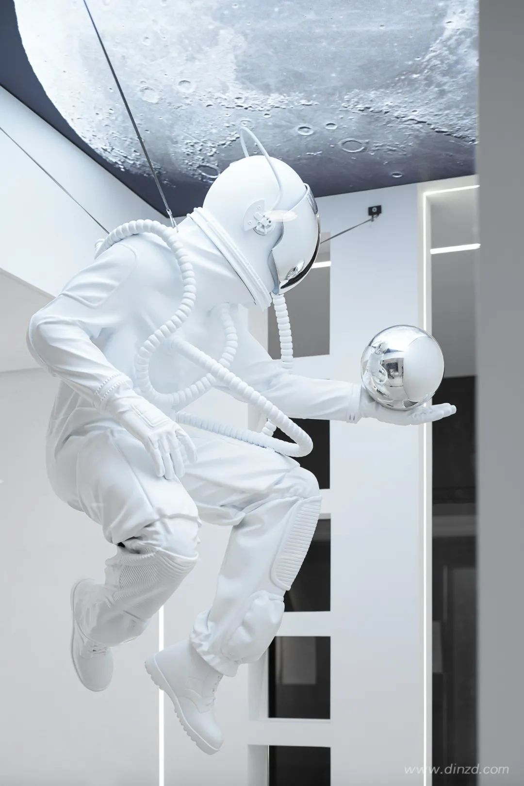
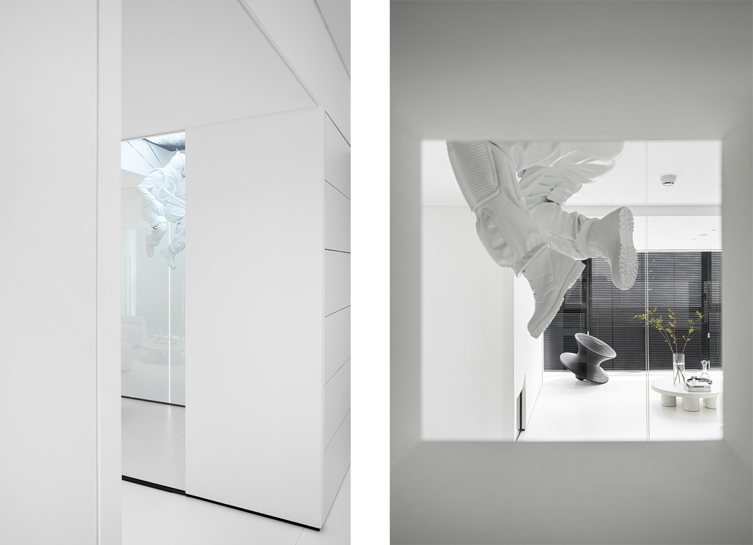
作為一個中軸空間,我們在小的空間里面做出了兩個場景,空間上面我們模擬了一個真空空間來作為一個電話間,給人一個安靜,不大的格子空間,有一個能打私人電話的空間,讓辦公室的其他人免受打擾,提高了效率。也營造了一個太空的場景,戲劇性的將真實的空間和非現實空間融合了在一起,不同時空交錯在一起,產生巨大的對比。
As a central axis space, we made two scenes in a small space. In the space, we simulated a vacuum space as a telephone room, giving people a quiet, small grid space, and one for making private calls. The space allows other people in the office to not be disturbed and improves efficiency. It also creates a space scene, which dramatically merges the real space and the unreal space, and different time and space are intertwined, creating a huge contrast.


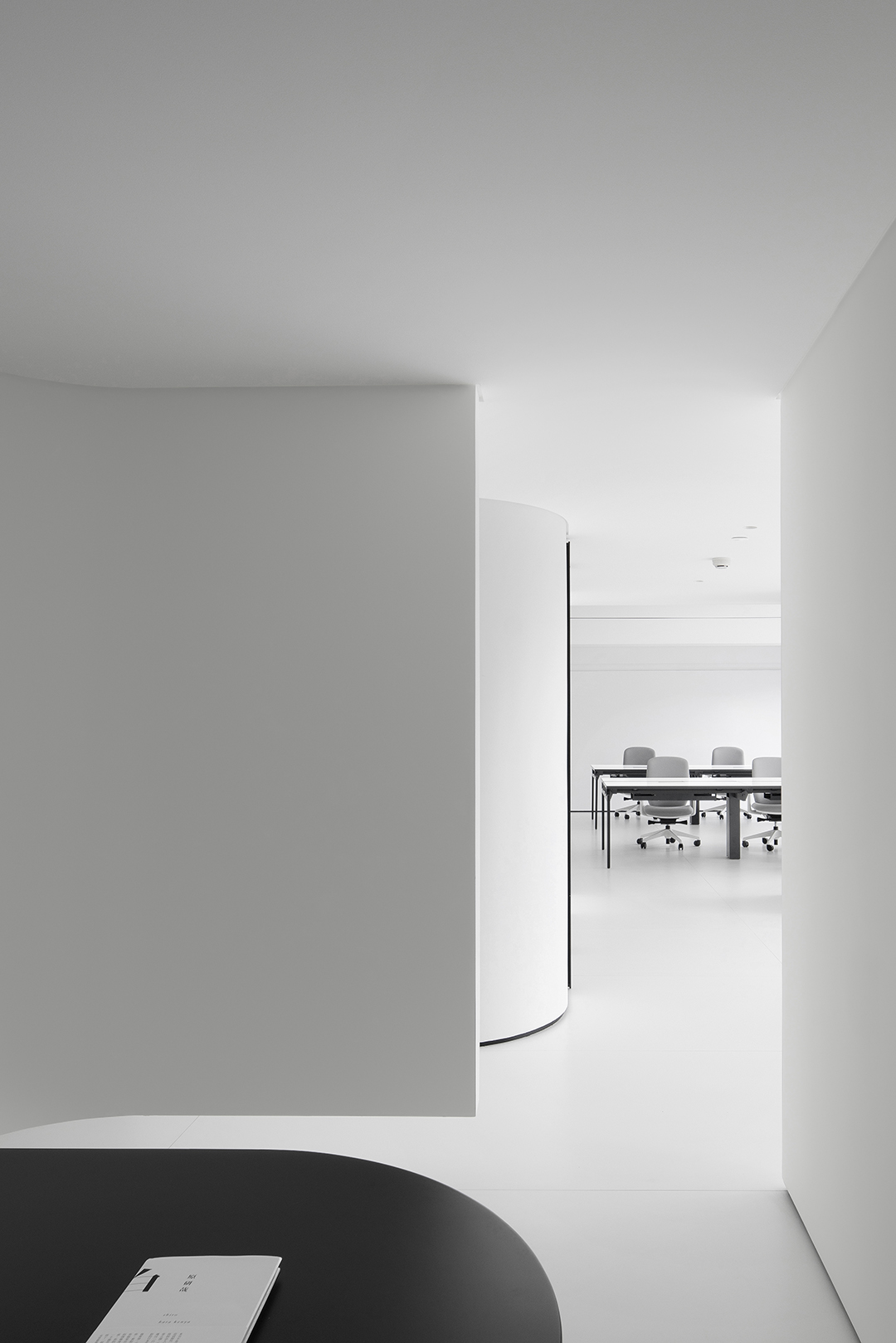
空間序列是指按通過一定的流線組織空間的起,承,轉,合等變化。在建筑設計的領域,設計師們往往會試圖遵從這一序列變化,從而突出充滿藝術感的協調美。同時空間序列旨在注重城市空間和環境相互關聯,強調其空間的連續性和組織關系,表現出一種有機的秩序感。Spatial sequence refers to the organization of the space's rise, inherit, turn, and union changes according to a certain streamline. In the field of architectural design, designers often try to follow this sequence of changes to highlight the artistic harmony. At the same time, the spatial sequence aims to focus on the interrelationship between urban space and the environment, emphasize the continuity and organizational relationship of its space, and show a sense of organic order.

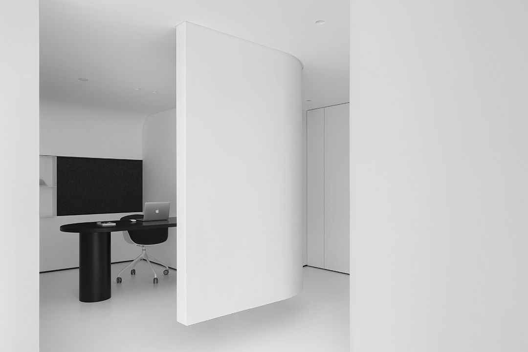
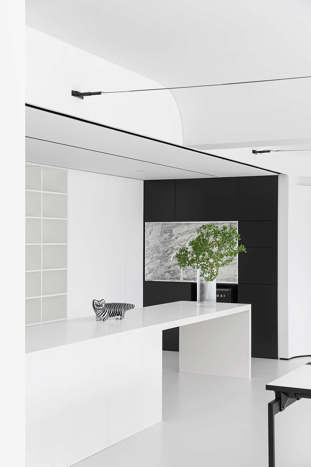
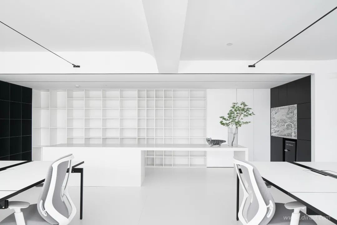
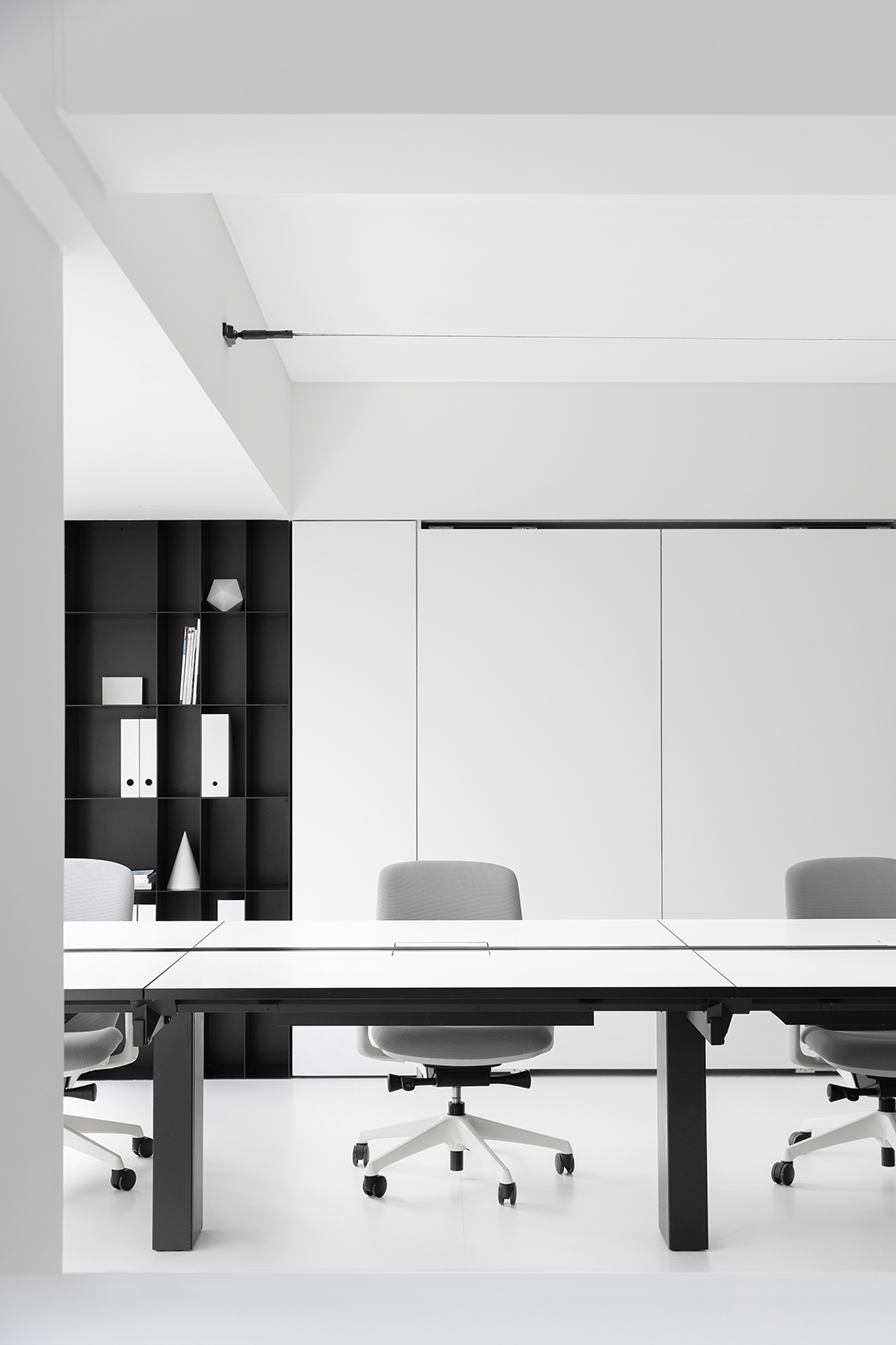
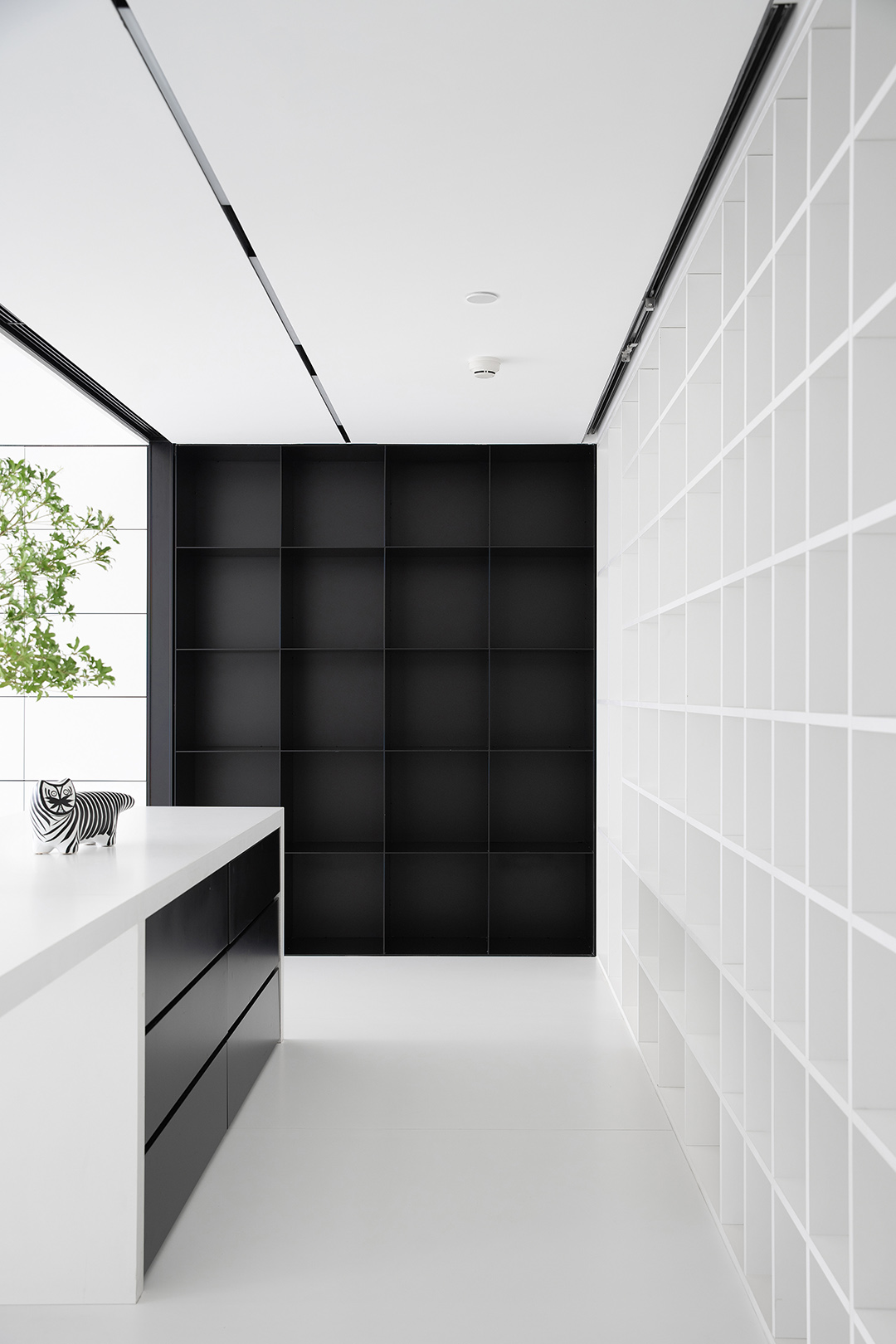
辦公區域通過序列空間的組織是以滿足辦公區域空間的各種功能為前提,通過重復中的變化來豐富形式的細節,以開合、急緩、松緊等節奏的配置形成空間序列。物料臺和吧臺一體化處理,天花柜體一體的黑白空間暗示了空間的分割,與辦公區域區分開來。
The organization of the office area through the sequence space is based on the premise of satisfying the various functions of the office area space, enriching the details of the form through repeated changes, and forming the spatial sequence with the rhythmic configuration of opening and closing, rapid, tight, etc. The material counter and the bar counter are integrated, and the black and white space integrated with the ceiling cabinet implies the division of space and separates it from the office area.


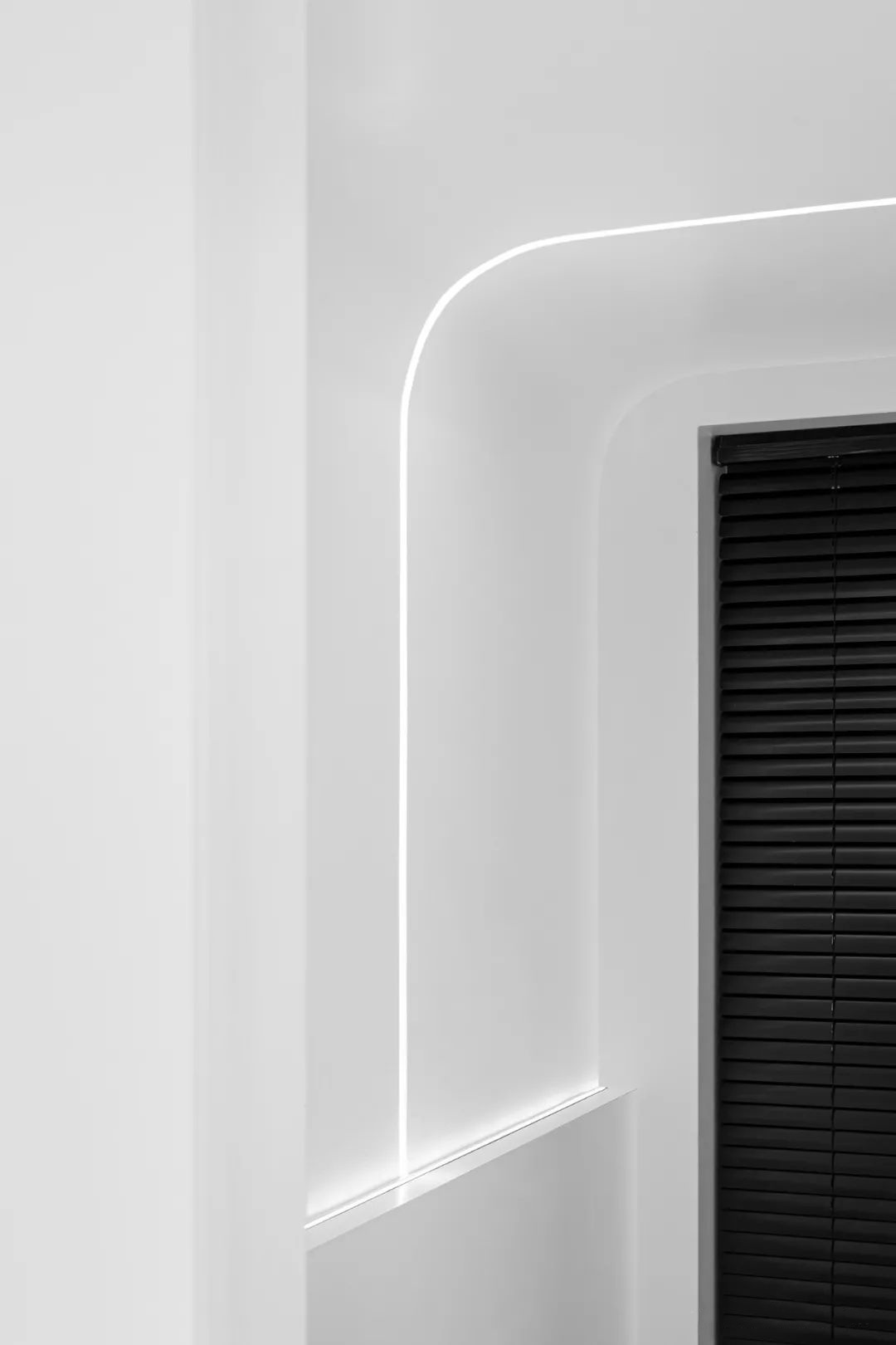
曲線表現出一種柔和的美,猶如女性般豐滿、感性、輕快、柔和、流動等特征。曲線運用主要是為了打破直線空間與環境的分裂,通過柔和的曲線來過渡空間。
The curve expresses akind of soft beauty, like a woman's fullness, sensibility, lightness, softness,flow and other characteristics. The use of curves is mainly to break thedivision between the linear space and the environment, and to transition thespace through soft curves.


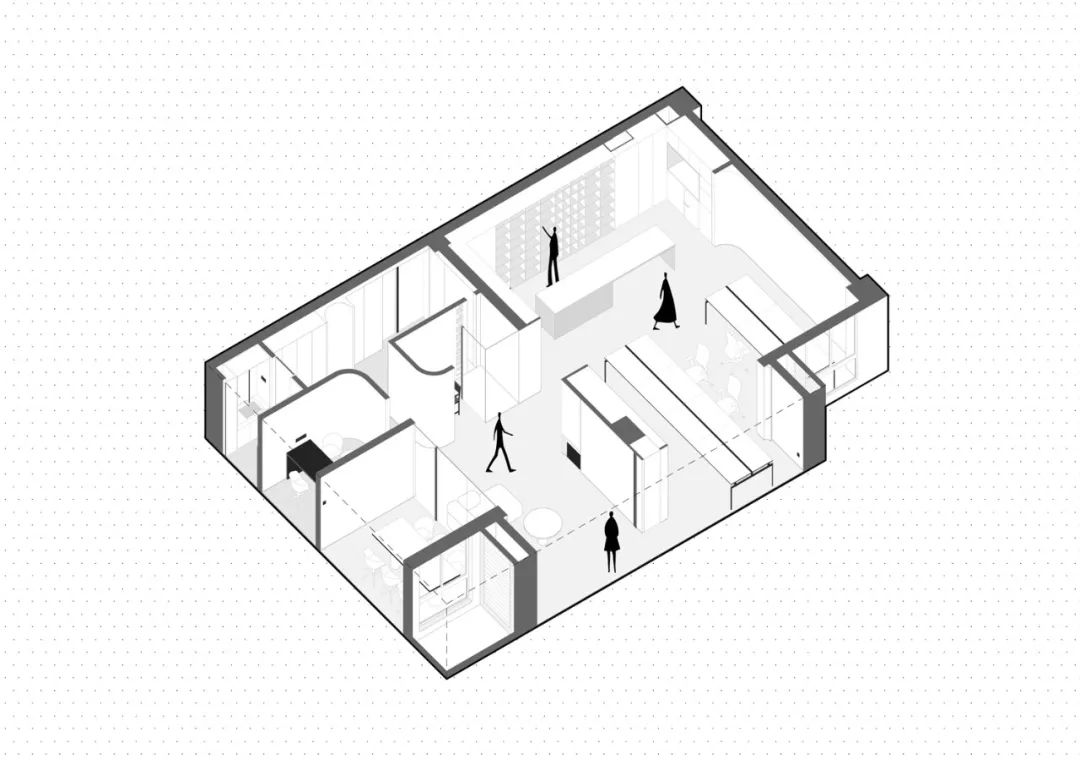
結構剖析圖

平面布置圖
Q1/ 您是如何理解辦公空間的美學?又是如何通過設計手法體現的?
A1/ 周海飛:現代辦公空間的設計思維方式在觀念上有著根本改變,突破了過去“依附于建筑內界面的裝飾來實現其自身美學價值”的傳統設計概念。希望在新的辦公空間上打破原有的生活化場景升級到藝術性,提高空間的氣質。空間上的處理盡可能的以空間與空間的關系為主,開放,純粹。
Q2/ 可以分享下整個項目的設計理念?或者您最滿意的一處空間的設計?
A2/ 周海飛:項目我們以品牌“知白”作為設計命題,在空間和視覺上面來詮釋對“知白”的理解。最滿意的是入口空間的轉換,空間入口從一個黑色的墻體進入到一個白色的空間,再進入到一個曲面的空間,空間的轉換以不同組合形式,串聯起來,不同的方向和尺度關系,呈現出有趣的對比關系和節奏,私密到開放,狹窄與舒張,幽暗與明亮,并傳達出不同的空間情緒。
Q3/ 整個空間以“白色”為主調,非常符合“知白設計”的氣質,暖色壁爐在白色空間中的作用是什么?
A3/ 周海飛:壁爐在空間中是一個氛圍的營造,也是空間的一個視覺焦點,讓靜態的空間“動”起來。
Q4/ 本次項目已經不是第一次與MOLONEY壁爐合作,能否談下一直選擇莫洛尼品牌的原因?
A4/ 周海飛:專業和好的產品,品類非常豐富,溝通高效快捷。

知白出自于《老子》,“知”意在知曉明了,“白”是一種狀態,對事物追求的極致。白為無,白為有,白又是空,大白至簡、大白無形。知白設計,從純粹的空間出發,追求空間的本質,去掉不必要的元素,讓必要元素凸顯,用建筑的思維和藝術的角度來詮釋空間的氛圍。
知白設計| Zhibai Design,正式成立于2019年,專注于室內空間的設計。我們追求極簡、純粹、物盡其用的設計理念,致力于最佳的空間規劃方案以及完整的品牌戰略方案,通過對空間的再創造提升設計的整體水準。我們重視設計的過程同時也同樣在意施工最后的完成度。
針對設計 愿永葆一顆純凈之心。
?
